Westergas
Westergas branding
The new identity and communication has led to locals, international visitors as well as creatives, to rediscover Westergas terrain as a cultural player of the city.
From source of energy to energising culture.
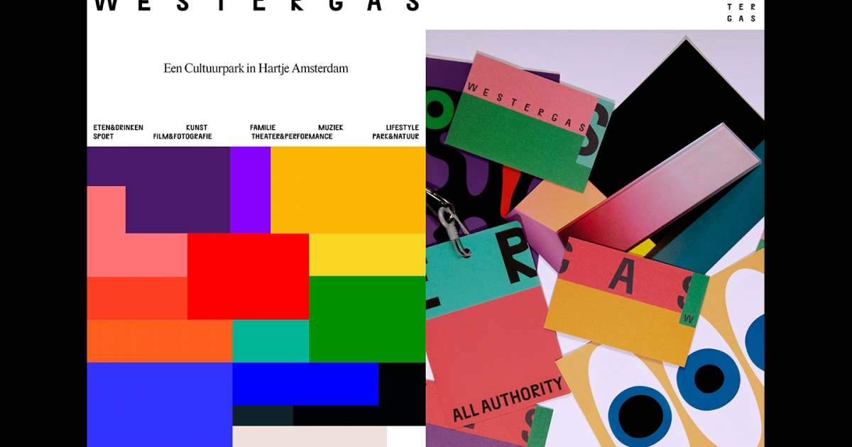
Express the vibrant mix of music, food, drinks, exhibitions, nature, cinema and family activities that visitors will find. We created a system that reflects the rhythm and intensity of the eclectic programming and audience, constantly interweaving with one another. A celebration of this unique place, where almost anything can happen.
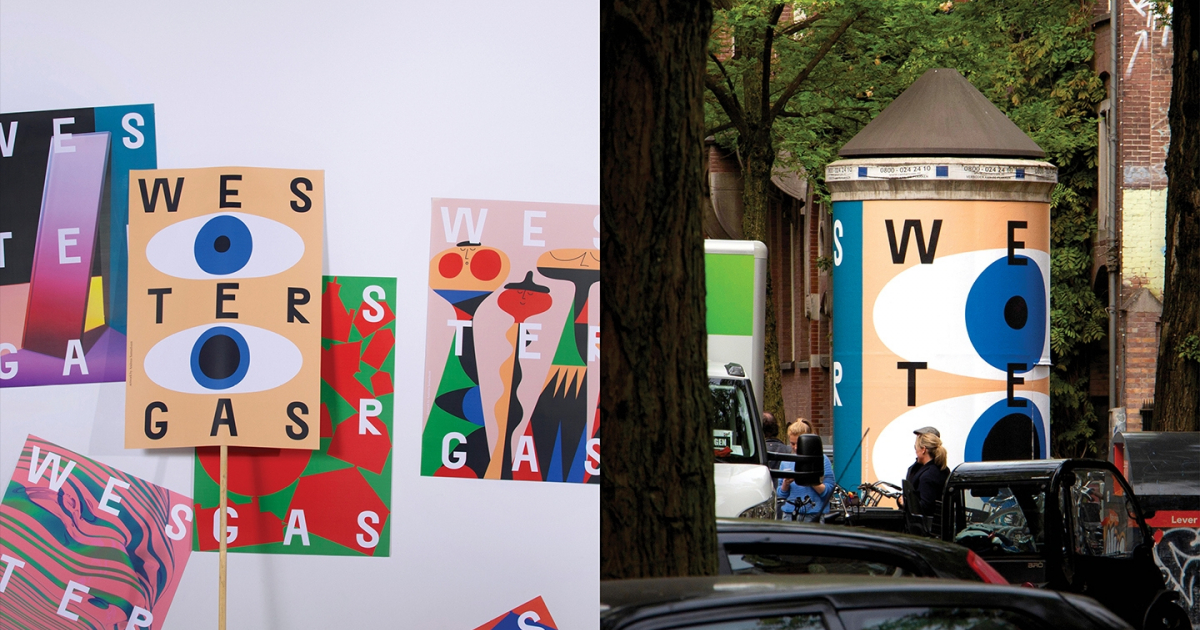
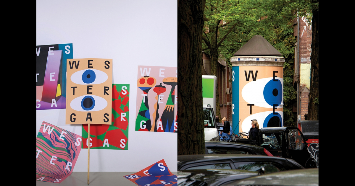
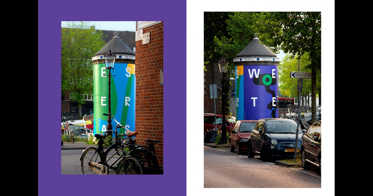
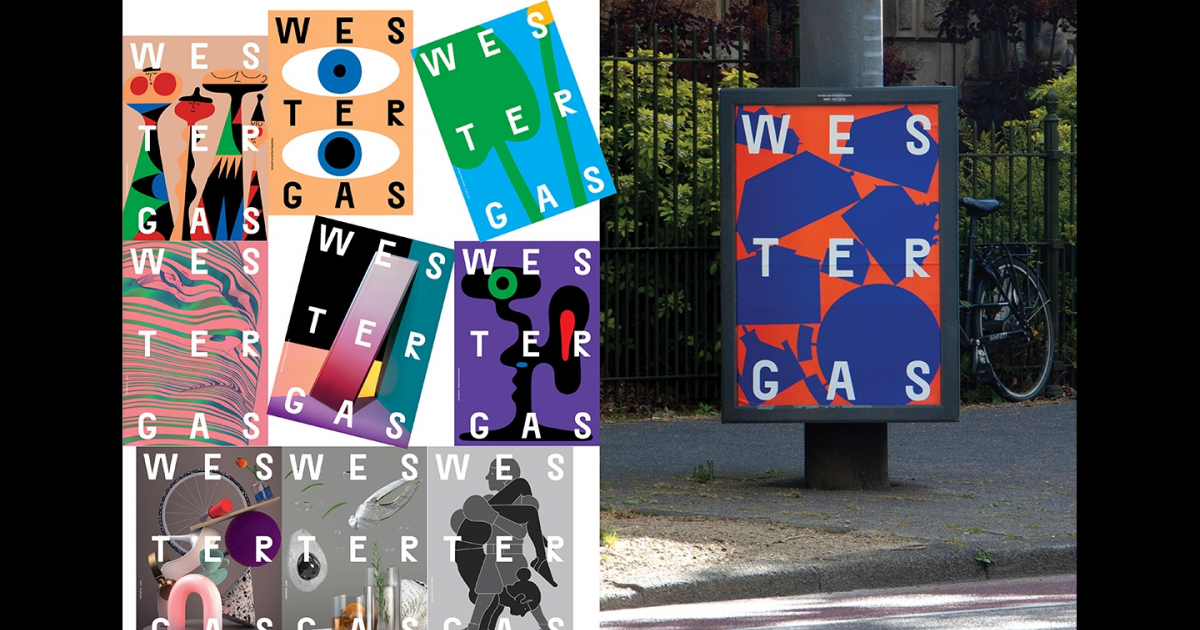
The system is fuelled by the word mark inspired on the unified but individual character of its buildings -echoing the main categories of Westergas’s programming- and a vibrant colour palette based on the use of opposing, complementary, colours. All in play in a rhythmic masthead system and layout that creates a stage and connects the contents.
The branding included a new website, a printed journal a.o. and was introduced in a city campaign where the different categories were brought to life in collaboration with artists like Andreas Samuelsson, Lennard Kok and Lonneke van der Palen.
Create the identity to express the new vision of the historical Westergasfabriek area. Challenge the existing perception of being a rental location, and become a new cultural destination for the city – with the aim of doing things differently. Combine a bold voice with a strong, recognisable system able to communicate different events to audiences from different ages. A dynamic place open to locals and visitors alike.


Jury Feedback
DESIGN – BRAND / SILVER
A unique identity system that perfectly embodies multi-disciplinary entities within this unique cultural park where creativity is celebrated. A flexible design system that allows playfulness, vibrancy, self-expression, and a mixed-media approach. A multi-layered approach delivering a visual feast for the eyes, clearly communicating to different audience types, and staying relevant to local culture. The jury loved the fresh, expressive, and noncorporate feel - "We all want to go there, to see what’s happening!" A return to the love of graphic design and the arts underpinned by the Dutch design way of thinking.