Amsteldok
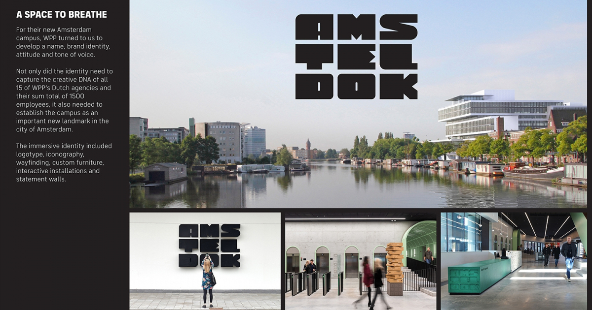
WPP turned to us to develop the name and brand identity of its new Amsterdam campus. The identity needed to capture the creative DNA of all 15 of WPP’s Dutch agencies and establish the campus as an important new landmark in the city.
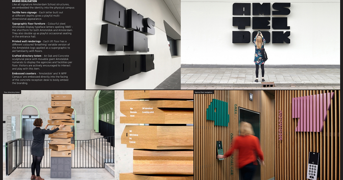
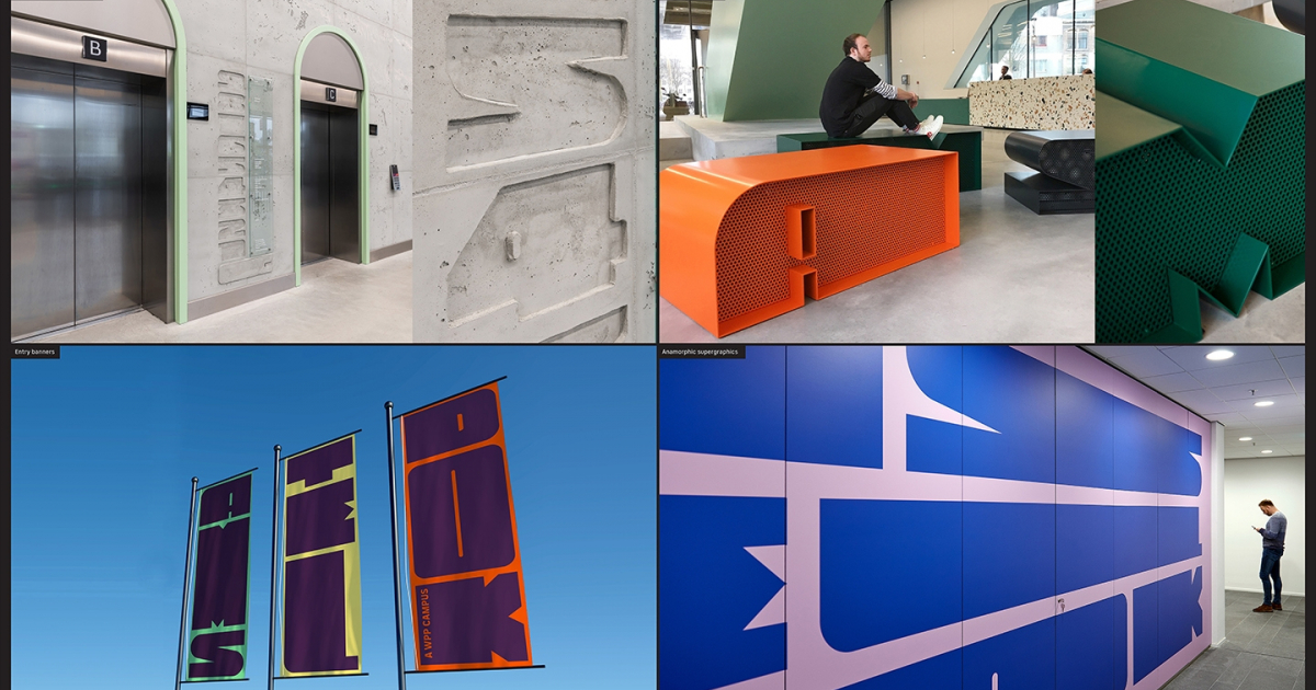
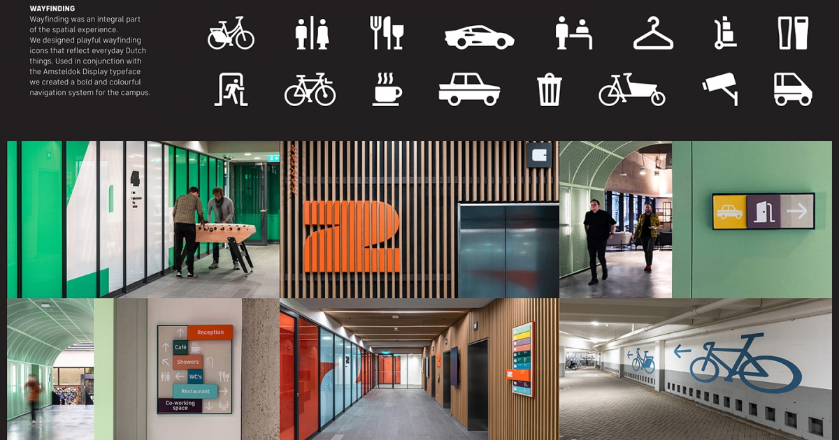
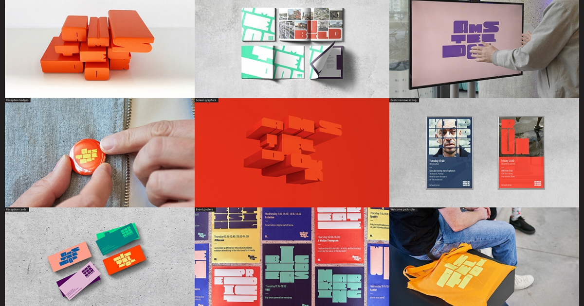
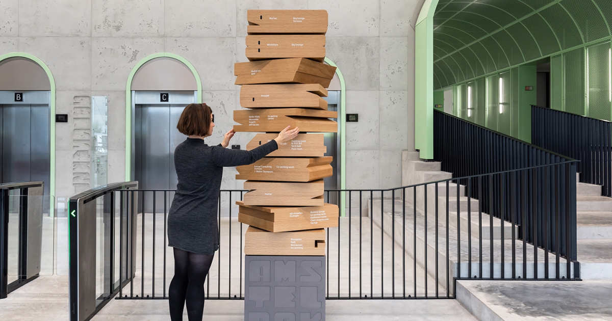
Like all signature Amsterdam School structures, we embedded the identity into the physical campus: tactile hero signage, typographic floor furniture, etched wall renderings, crafted directory totem and embossed counters. The logotype also functions as a template for all online/digital programming and communication. The colour palette was also directly derived from the architectural materials used by the architects. Wayfinding was an integral part of the spatial experience.
The name and brand identity were integrated at the campus in the lead up to the official opening on April 1, 2019 by the Mayor of Amsterdam, Femke Halsema, and WPP CEO Mark Read. The campus now houses all 15 WPP Dutch agencies and 1500 people. On the opening day, the stockprice of WPP reacted with 5% increase within an hour, which equals a value of 500 million Pounds. Moving forward, WPP has already started to roll out this visual identity framework for all its WPP campuses worldwide.
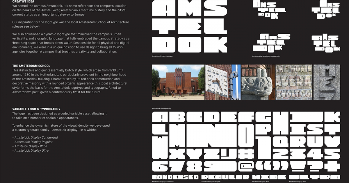
We named the campus Amsteldok. It’s name references the campus’s location on the banks of the Amstel River, Amsterdam’s maritime history and the city’s current status as an important gateway to Europe. We wanted a logotype that was directly inspired by the physical structure and found the Amsterdam School of Architecture – an expressive 20th century style predominant throughout the city – an important inspiration for our typographic forms. We envisioned a dynamic logotype that mimicked the campus’s urban verticality, and a graphic language that fully embraced the campus strategy as a ‘breathing space that breaks down walls’. Responsible for all physical and digital environments, we were in a unique position to use design to bring all 15 WPP agencies together. Design would contribute to the campus as a living entity, not just another staid structure. A campus that breathes creativity and collaboration.
When leading communication services multinational WPP decided to brand its new Amsterdam campus, they turned to us to develop a name, brand identity and overall attitude and tone of voice. Not only did the identity need to capture the creative DNA of all 15 of WPP’s Dutch agencies and their sum total of 1500 employees, it also needed to establish the campus as an important new landmark in the city of Amsterdam. The end result was a total brand identity immersed into every aspect of the campus – from logotype, iconography, wayfinding and tone to custom furniture, interactive installations and statement walls. Moving forward, the conceptual framework we created will be applied to other WPP campuses around the world.
Jury Feedback
DESIGN – BRAND / BRONZE
A solid and robust piece of work rooted and inspired by Dutch brutalist architectural typography and the story behind the Amsteldok location. This project was a well thought out system that is multi-layered allowing typography to flex for a multitude of different applications from 3D external signage, way finding to playful furniture (and so much more). It is a playful connection to the building housing a multitude of creative talent. It very much delivers.
Overall, there is merit to be given in creating an identity of cultural relevancy, and it’s playful extension into the various spaces. It is an exceptionally well-executed project, solid in thinking, execution, and application.This entry was discussed at length and had divided opinions. Not all jury members were sure if the identity fitted the building. Some commented that the logo was quite ordinary and missed an opportunity beyond referencing the Amsterdam ‘old school’ typography. Others liked the contrast and the robust nature of the system which is echoed in the cubes of the new building.