8 VPRO idents
In 2015 VPRO developed a new basic-infrastructure for its digital department, creating room for cross-media
concepts in programming. Specific attention was given to VPRO’s youtube channel, which in 2015 received over
69.422 new youtube followers. In 2016 digital channels grew with an average of 40% in numbers.
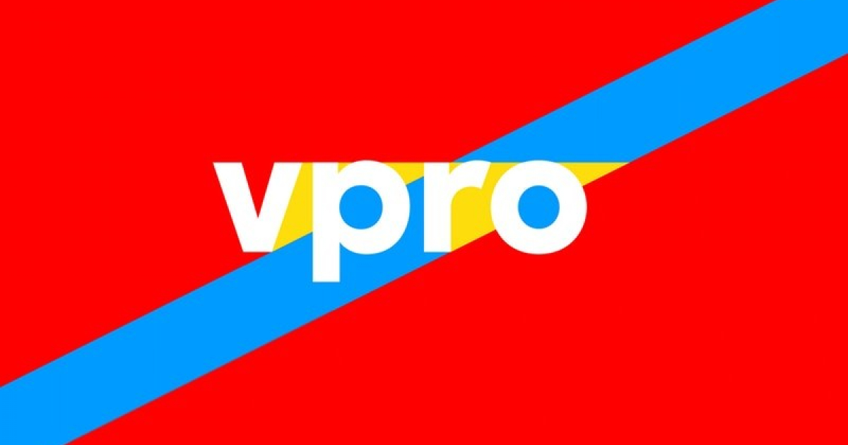
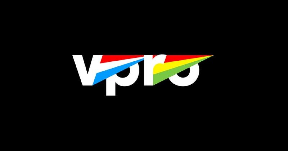
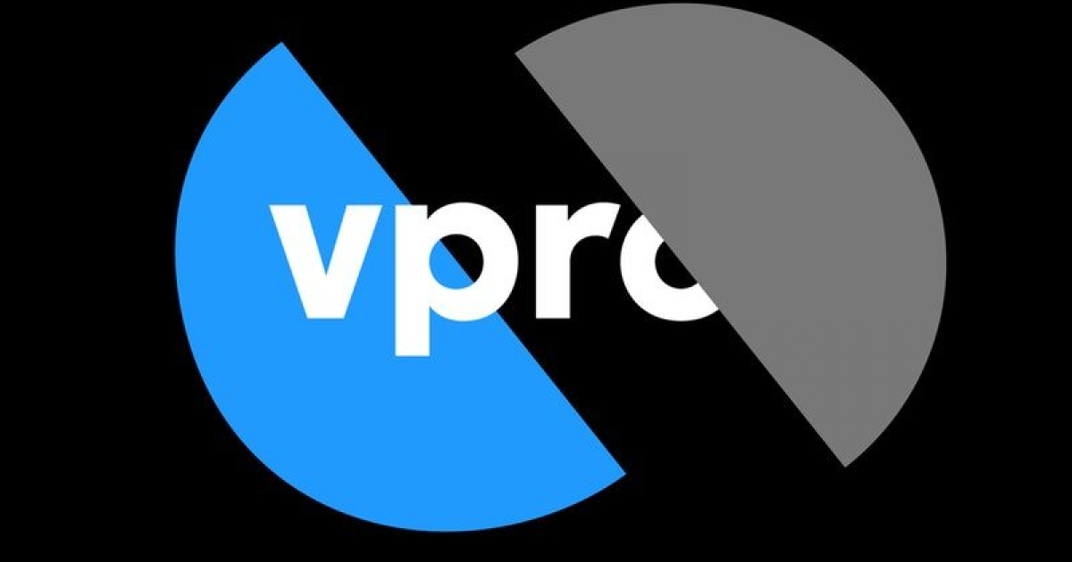
The logo has been designed for flexible use, with over a billion separate forms varying through color differences, gradients, patterns and radiation. The animation of all these possibilities forms the on-screen identity. Together with the identity, we created targeted campaigns to develop the VPRO as the strong, well-known and respected broadcasting channel that they are. In this specific case we designed VPRO’s youtube idents relating to four main themes: world stories, documentary, extra and metropolis.
The VPRO is known for producing and broadcasting quality (and sometimes avant-garde) programs, documentaries and films, the target audience of the VPRO could be considered as mostly highly educated and creative people.
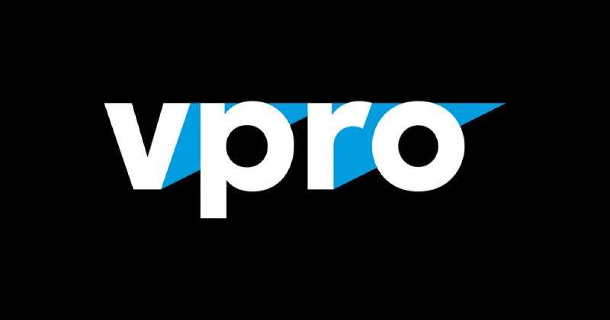
Our new logo consists of the letters V P R O, like the old logo, but in a newly developed font. The o’s symbolize eyes
watching television - and the radiating triangles are a direct reference to broadcasting.
Online is becoming more and more relevant for a broadcasting company like the VPRO. How to develop a super
short ident that fits the brief and expresses the key values and themes of the VPRO.