Stichting Lezen en Schrijven (Reading and Writing Foundation)
One in five European adults have difficulties reading and writing. This is unacceptable, morally and economically. The revitalized identity increases accessibility by simplifying all brand elements and communicating with a descriptive illustrations.
During the process we worked closely with the audience of Stichting Lezen en Schrijven who provided positive feedback regarding accessibility and readability. This ensured the brand is successful in its task. We believe the designs will help Stichting Lezen en Schrijven to communicate more clearly and coherently and help their target audience to clearly navigate the brand. Whilst also providing a solid and clear guideline for other studios to replicate the simplicity.
Additional
The new brand identity for Stichting Lezen en Schrijven was launched on the 3rd March 2020. We will work with other studios to design the website in the coming months.
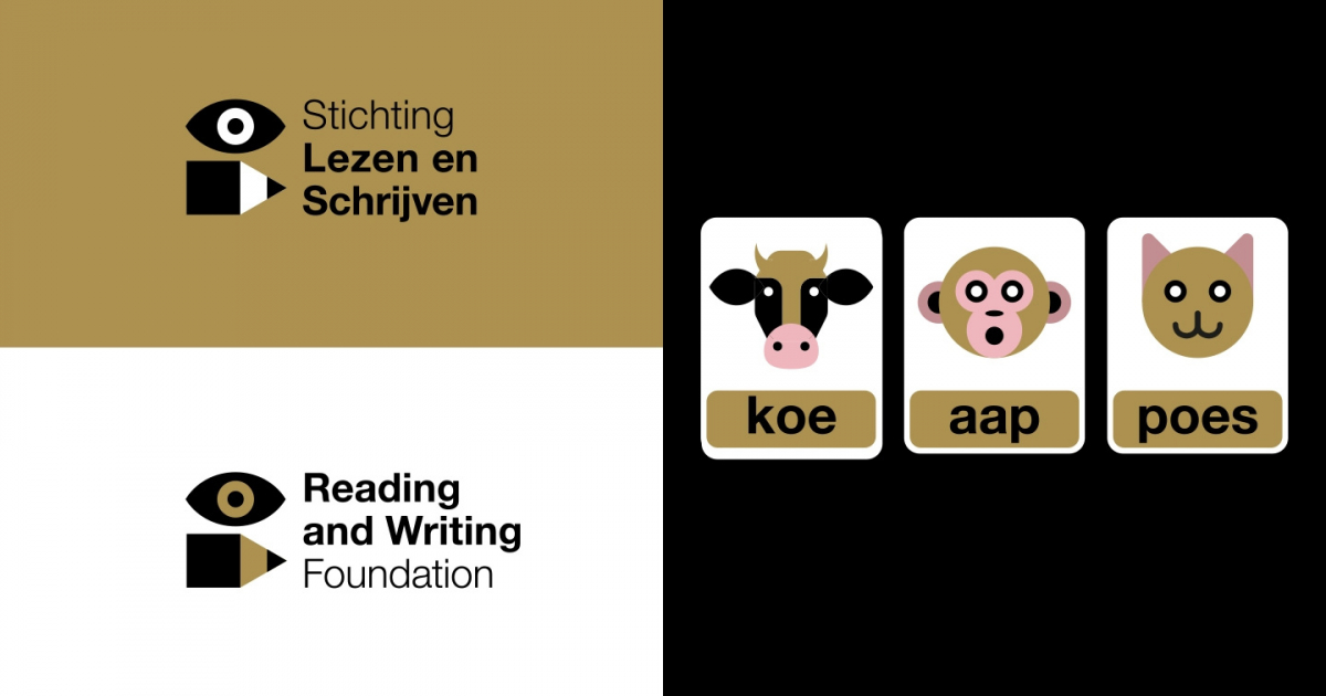
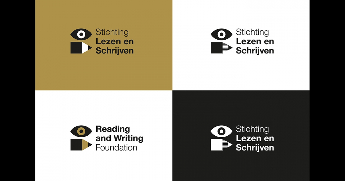
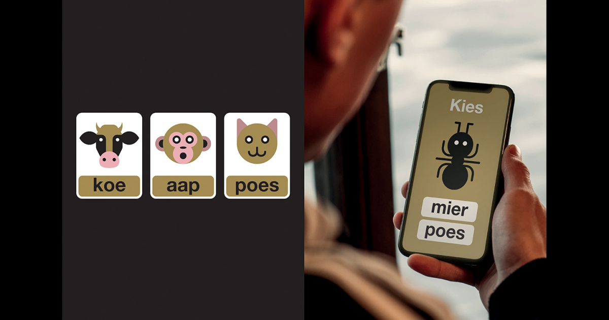
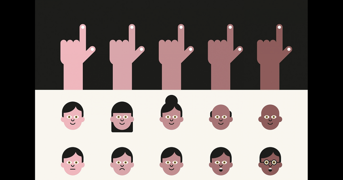
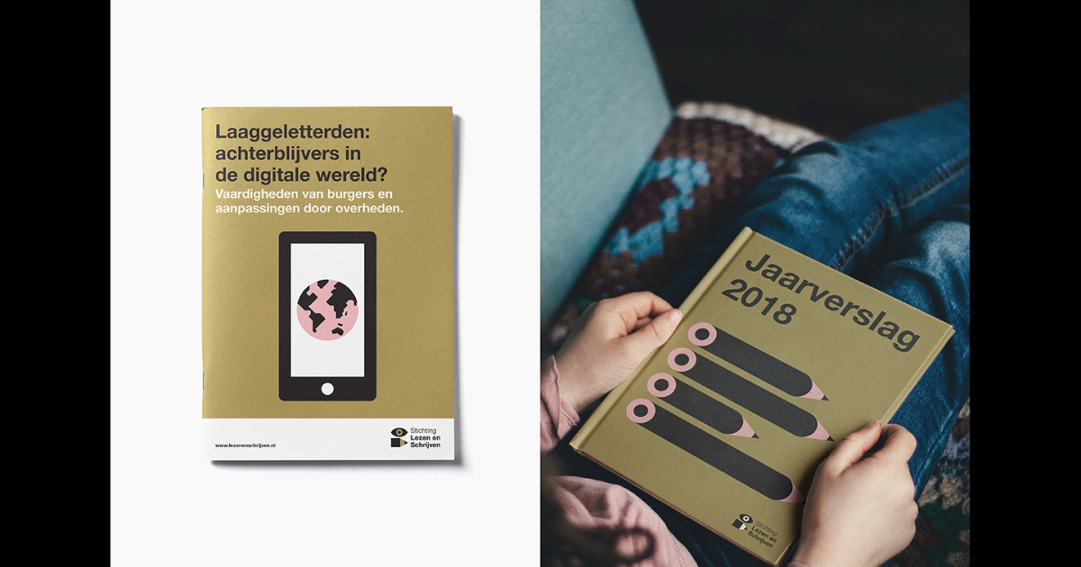
In order to increase their accessibility and recognizability, we created an illustration style. The illustrations are literal and when paired with a strong title, convey the message in the simplest form. Ensuring communication is accessible and understandable even to a less literate audience. This is where we found the idea for the logo, an eye and pencil symbolizing ‘reading and writing'.
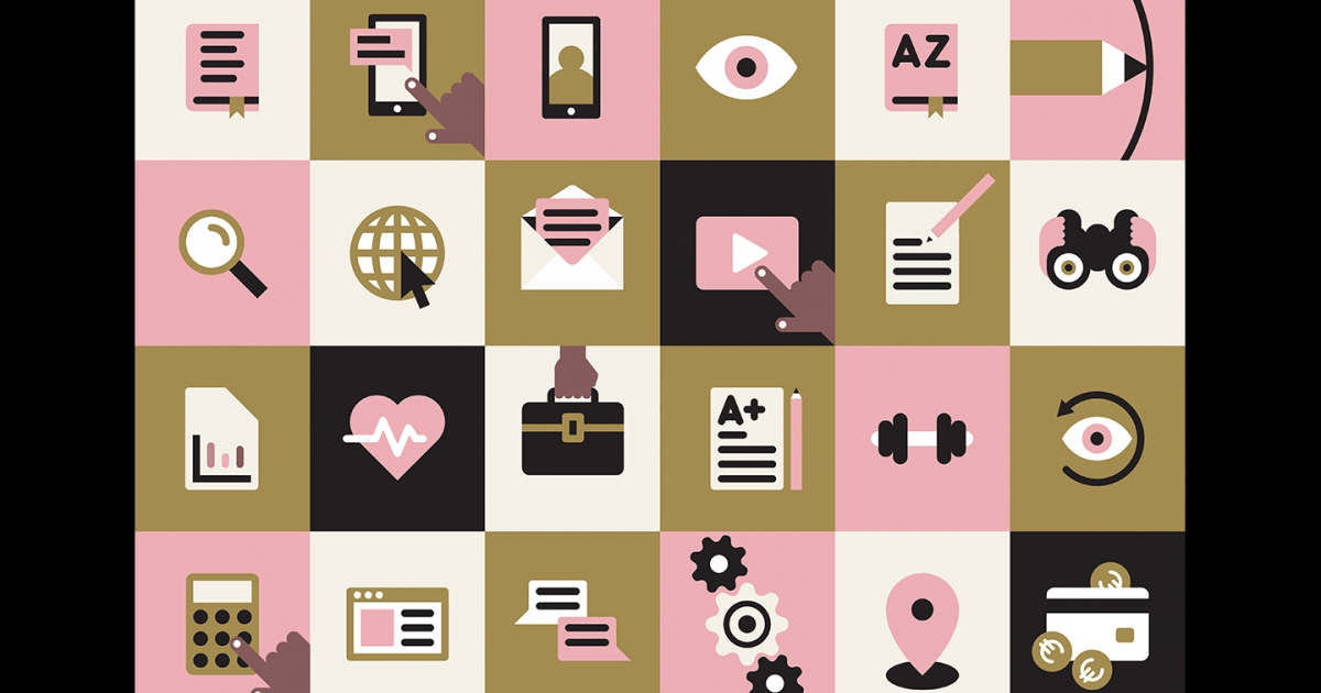
We used simple geometric shapes to construct flat illustrations, ensuring the same iconic style is implemented cohesively across the entire brand. The simple style also allows illustrations to be easily converted into single colour icons.
Colour was also very important. To further increase recognizability and accessibility we defined a colour palette that would appeal to everyone. ‘Warm rose’ was added to give a human and approachable feeling. A key task was to represent diversity in the illustrations, so we defined a palette of skin tones which harmonize with the brand whilst representing diversity.
One in five European adults have difficulties reading and writing. They face obstacles in their attempts to participate in modern society and often feel excluded. This is unacceptable, morally and economically. In response to this, Her Royal Highness Princess Laurentien of the Netherlands founded Stichting Lezen en Schrijven (Reading and Writing Foundation) in 2004. Its mission is to prevent and reduce literacy difficulties in the Netherlands and in Europe.
Stichting Lezen en Schrijven asked us to revitalize their existing brand identity, with the key task of increasing accessibility and recognizability for a wide audience. We also had the task of bringing coherence to the brand, ensuring their sub-brands and campaign materials are clearly recognized as part of Stichting Lezen en Schrijven.
Jury Feedback
DESIGN – BRAND / NOMINATION
Nice to see the art of a simple idea back within a visual identity. Overall a positive tone delivered for a valid need which is well executed. The jury liked the simplicity of the logo: an eye and a pencil (an organisation that helps adults struggling to read and write). The simplicity of graphic style and colour palette delivers a thorough icon set to aid learning.
A minor concern: felt like there was a slight disconnect between the identity through to visual language. Does it appeal more to children rather than an adult audience? However, within this sector – it stands out and a worthy Nomination.